The UI was killing the deal
WireScreen had world-class data worth tens of thousands of dollars per seat. But the platform’s information architecture was so misaligned with how analysts actually work that users were recommending their organizations pause on new seats. The UI wasn’t just inconvenient — it was actively undermining the sales conversation. I restructured the product’s information architecture so the data’s value became self-evident, and helped close six-figure partnerships.
Project Details
- COMPANY
- WireScreen
- ROLE
- Lead UX Designer
- LENGTH
- 4 months
- TEAM
- 1 UX + 3 dev
- YEAR
- 2024
About WireScreen
WireScreen is a corporate intelligence platform founded by two-time Pulitzer Prize winner David Barboza. Clients pay six to seven figures for access, because it allows government analysts to uncover hidden relationships between companies that cause regulatory risk or national security threats.
David recruited me specifically because I’d designed PitchBook. He wanted that same rigor applied to making a world-class dataset actually usable.
Analysts were telling their organizations they didn’t need to pay for seats.
The feedback
Government analysts reported that the card-based layout was actively slowing them down. Several said they preferred working with raw data exports because the UI itself was hindering their analysis — making the platform feel like an obstacle rather than a tool.
The blind spot
Analysts were missing entire datasets because they never discovered horizontal scrolling within the card layout. Critical information was present in the system but invisible in the experience. The data was there. The interface hid it.
The business impact
Analysts were recommending their organizations pause on additional user seats until the platform matured. They saw the data’s potential but felt the product was wasting their time. When your end users are telling procurement to stop buying, you don’t have a UX problem. You have a revenue problem.
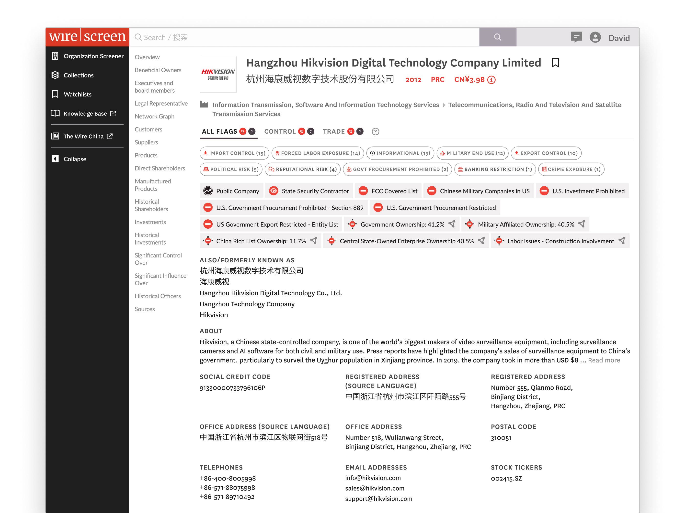
Old design: data needed to verify the correct profile was buried.
Social credit codes, registered addresses, stock tickers — the identifiers an analyst opens a profile to verify were below the fold. The page was organized around what looked good in a demo, not around the job the analyst was hiring the product to do.
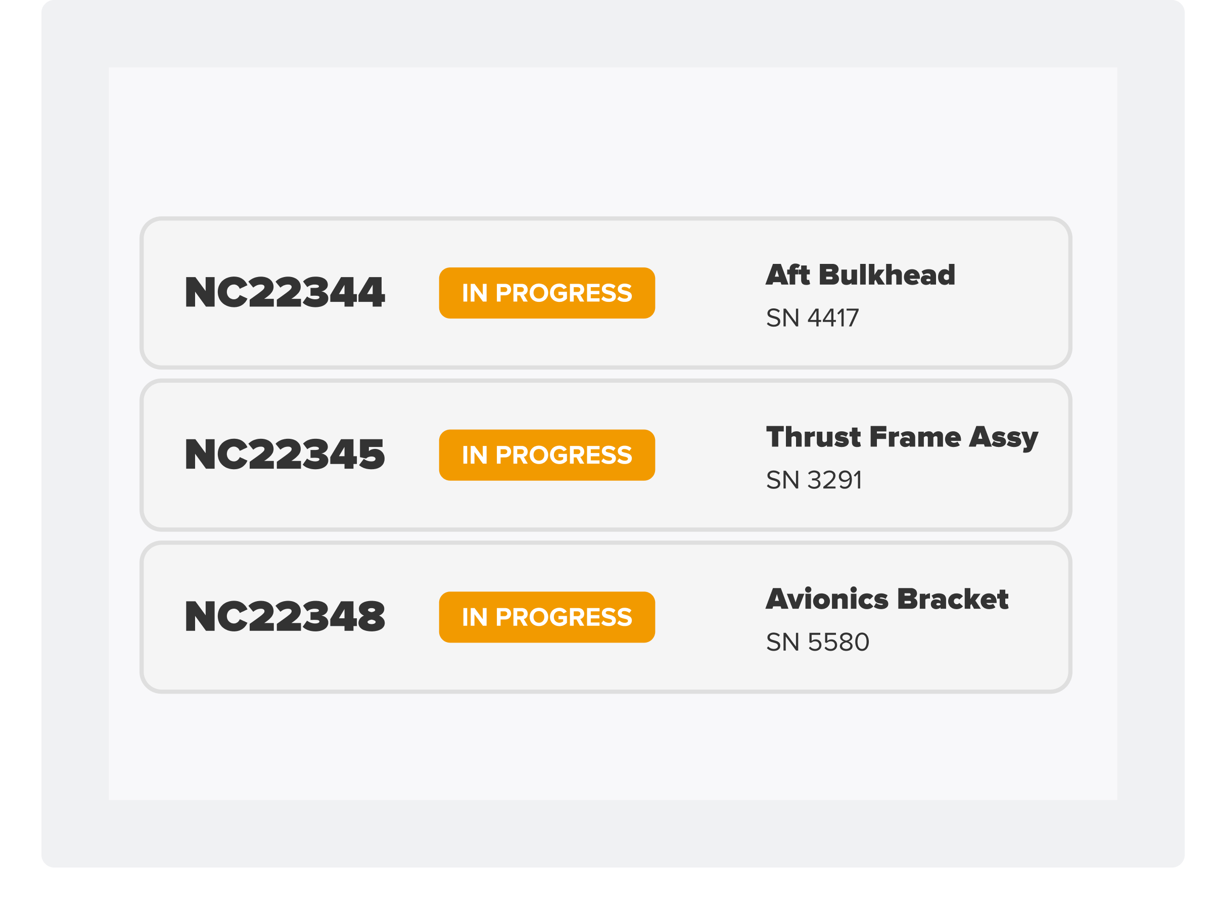
Old design: valuable data was trapped in a format designed for browsing, not analysis.
The card layout presented well in screenshots but collapsed under real use. Analysts scanning dozens of entities couldn’t compare across cards, couldn’t sort, and often didn’t realize there was more data hiding behind a horizontal scroll.
If you only do one thing, please put data into tables. I can’t do my job with these cards.
The platform’s data presentation was undermining its own value proposition.
WireScreen had built a data product and wrapped it in consumer-grade chrome. The visual choices optimized for first impressions — cards that looked modern in a pitch deck — at the expense of the repeated, high-stakes analytical workflows that justified the price tag. The information architecture needed to be rebuilt around how analysts actually work: comparing, verifying, tracing networks across entities.
Restructuring the information architecture
Analysts are browsing entities. Give them a visually engaging grid.
Analysts are verifying entities and tracing networks. Make the data’s structure self-evident.
The card layout wasn’t just a visual preference issue — it was an information architecture failure. Analysts reviewing ownership networks across dozens of entities need to compare, sort, and scan. Cards prevent all three. Worse, the horizontal scroll within cards meant analysts were routinely missing data that was present in the system but invisible in the experience.
I made the call to remove the card pattern entirely and rebuild around dense, sortable tables. I had to defend that decision against the team that had built and shipped the card system. The argument wasn’t aesthetic. It was strategic: cards optimized for the demo, tables optimized for the workflow that justifies the price.
Social credit codes, registered addresses, stock tickers — the things an analyst opens a profile to verify — were buried at the bottom of the page. This wasn’t a layout problem. It was a misunderstanding of the user’s job. An analyst opening a profile is verifying an entity, not browsing it. I restructured the page hierarchy to put identifier data above the fold — a statement about who the product is for and what job they’re hiring it to do.
Features like Watchlist and Knowledge Base were hidden behind a profile menu. New users never discovered them. Demo audiences never saw them. This compounded the perception problem: analysts were evaluating a single tool when the product was actually a platform. Sales was pitching breadth the UI actively concealed.
I introduced a persistent left sidebar so the broader platform was discoverable on every page. The product stopped feeling like a standalone search tool and started presenting as the platform that justified the price. Navigation as positioning.
I tied the visual system to David Barboza’s NYT and Pulitzer roots. Newspaper-inspired typography, sharp framing, editorial density. This was the riskiest call. Not because anyone objected to the direction, but because it meant the product would look and feel fundamentally different from every competitor in the corporate intelligence space. It was a deliberate bet that WireScreen’s competitive moat is investigative credibility, not SaaS polish, and the UI should signal that on first impression to a federal buyer.
Before
After
Results.
6-figure partnerships unlocked
Analysts who had previously struggled with the platform became its strongest advocates. Former detractors closed 6-figure partnerships with agencies our GTM team had limited access to — the product started selling itself.
Reversed the seat-pause recommendation
Analysts who had been advising their organizations to hold off on additional seats stopped giving that feedback after the redesign shipped.
Eliminated critical data blind spots
Horizontal-scroll data loss and below-the-fold burial were resolved. Analysts could see the full dataset without discovering hidden UI affordances.
Raised product credibility for enterprise buyers
The visual system, navigation architecture, and data presentation signaled platform maturity that matched the price point.