Addressing the question that was stalling sales — before anyone asked.
The WireScreen data was valuable, but finding hidden relationships — a critical task for government analysts — had a serious bottleneck. Tracing corporate networks required manually clicking through profiles, extracting data manually from tables, and piecing relationships together by hand in external tools. One of the most common asks in sales demos was “can the platform show me the connections between Company A and Company B?” The answer was no, and that no was slowing sales cycles and costing us deals.
Project Details
- COMPANY
- WireScreen
- ROLE
- Lead UX Designer
- LENGTH
- 4 months
- TEAM
- 1 UX + 5 dev + 2 PM
- YEAR
- 2025
About WireScreen
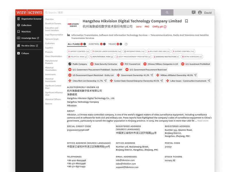
WireScreen is a corporate intelligence platform founded by two-time Pulitzer Prize winner David Barboza. Clients pay six to seven figures for access, because it allows government analysts to uncover hidden relationships between companies that cause regulatory risk or national security threats.
David recruited me specifically because I’d designed PitchBook. He wanted that same rigor applied to making a world-class dataset actually usable.
The gap wasn’t in the data. It was in the tool’s ability to justify the price tag
The problem
WireScreen had incredibly valuable data, just no easy way to see how it linked companies together.
The cost
WireScreen sells risk intelligence at enterprise prices. Without a connection layer, analysts struggled to show check writers the value.
The stakes
Seven-figure deals stalled. Sales cycles dragged. Renewals got harder to defend.
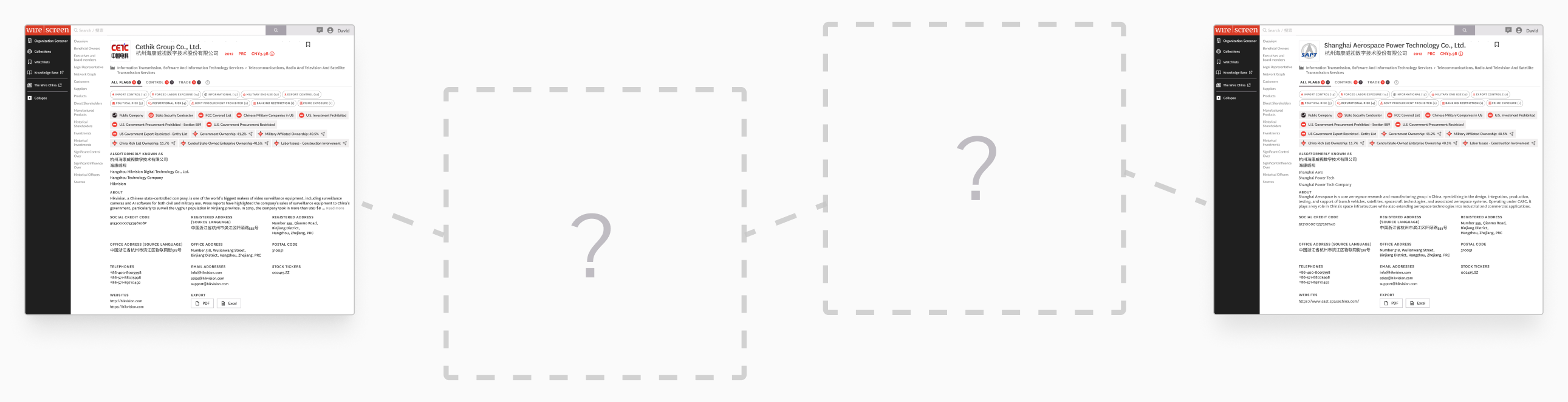
The platform couldn’t find the connection between two companies — analysts had to do it completely manually.
This is how analysts used “world-class data” to answer
“Is Company ‘A’ connected to Company ‘B’?”
- 01Open Company A’s profile
- 02Investigate each of company A’s investments
- 03Search through the investments of the investments
- 04Search through the investments of the investments of the investments
- 05Investigate companies with shared address, phone, website, email
- 06Investigate executives looking for connections between both companies
- 07Repeat steps 1–6 for shareholders…
- 08Repeat steps 1–6 for supply chain customers…
- 09Repeat steps 1–6 for suppliers…
- 10Repeat steps 1–6 for controlled companies without direct ownership…
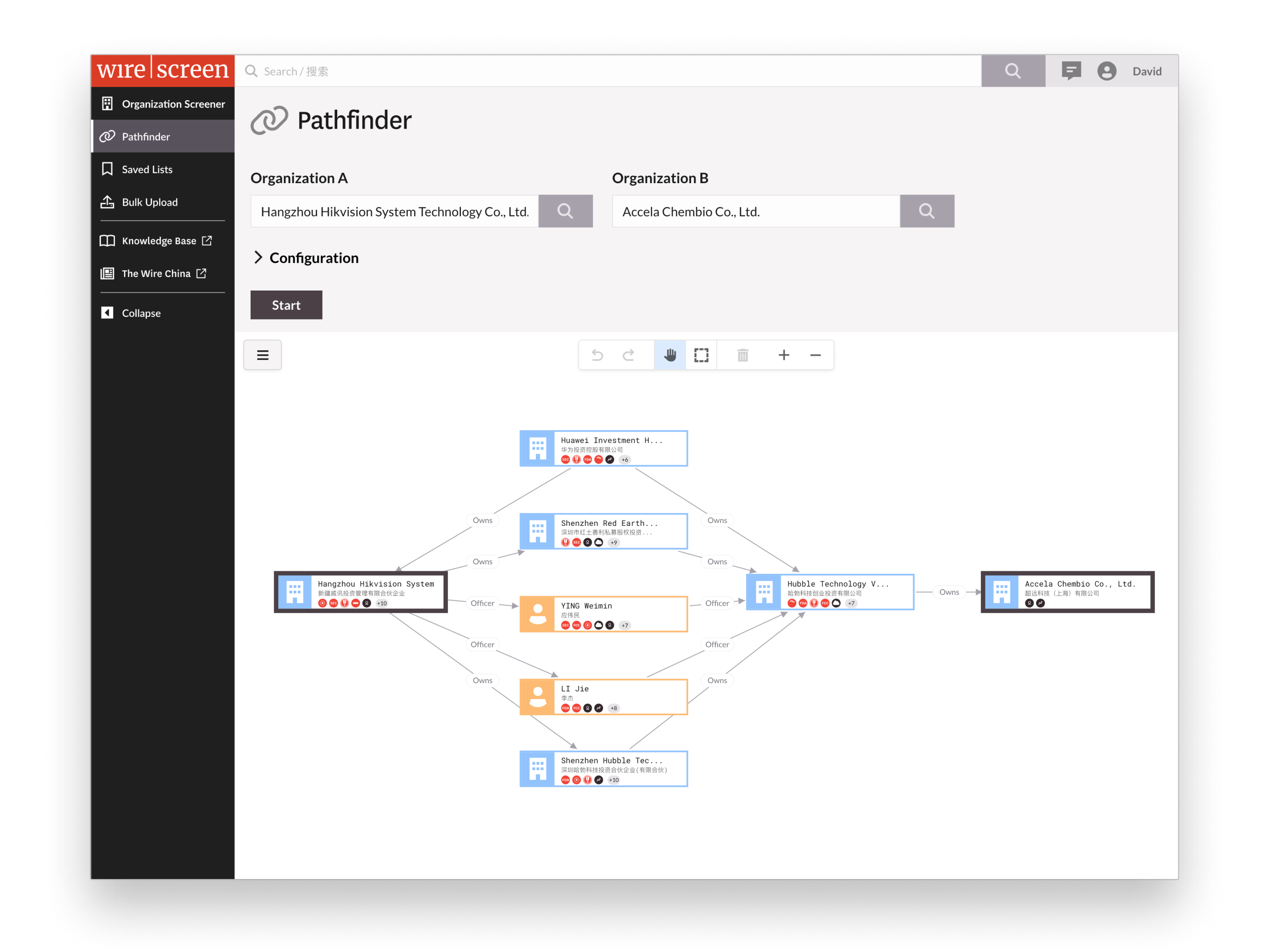
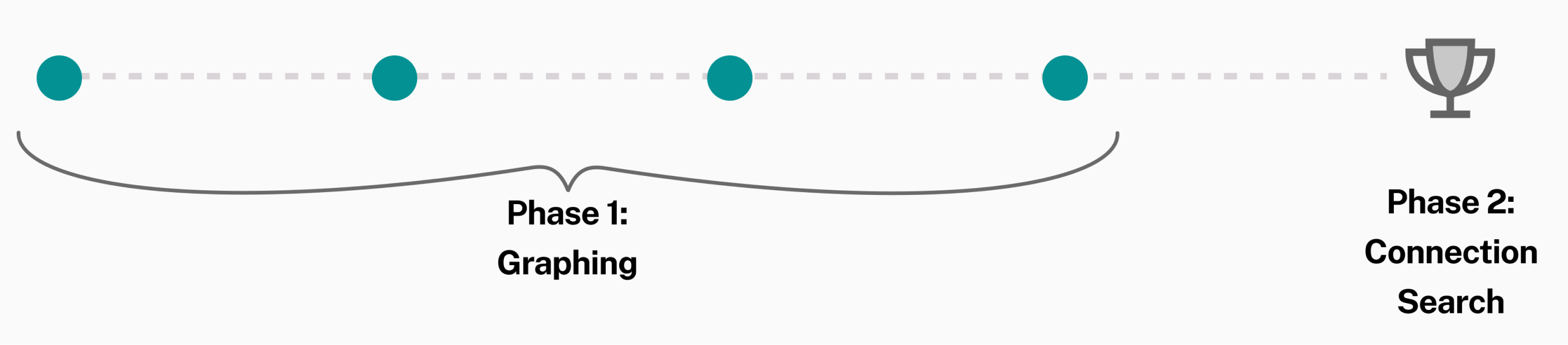
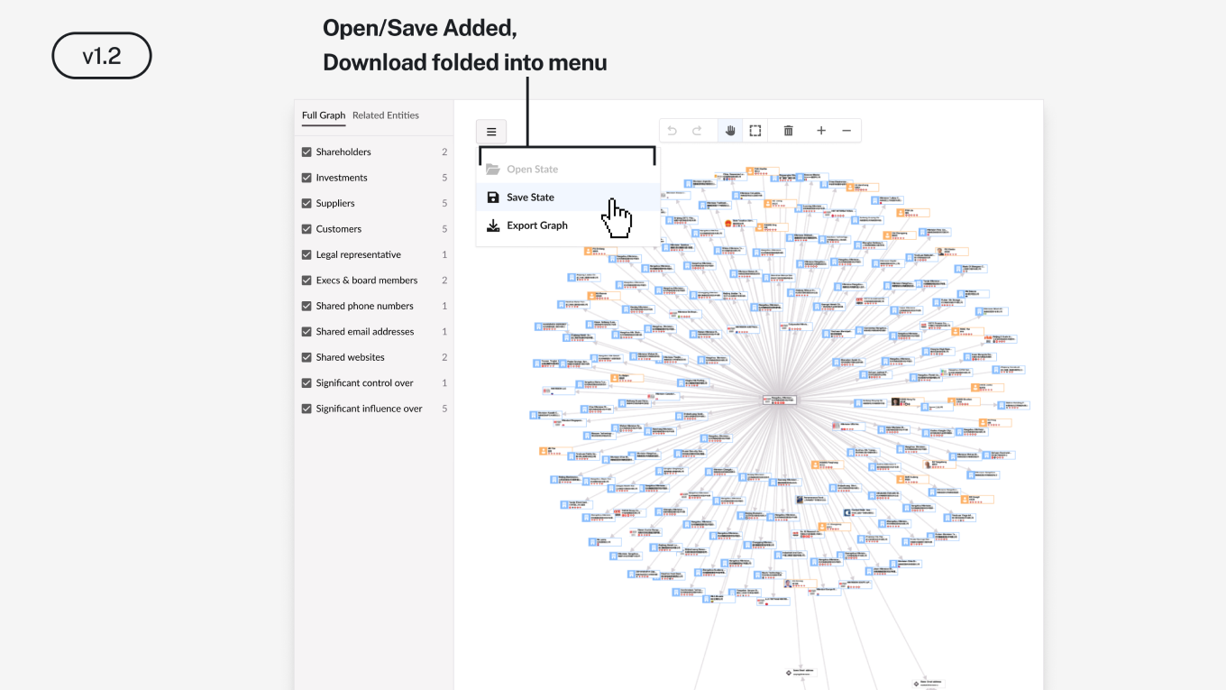
Searching for connections between companies wasn’t on the roadmap yet, but graphing company networks was. I made graphing the Phase 1 and connection searching became Phase 2. Each Phase 1 decision would build towards Phase 2: the graphing platform, rendering model, and feature sequencing. Phase 1 would build the momentum for Phase 2, and when Phase 2 was green-lit, we would have the foundation.
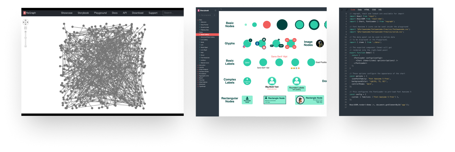
The team was evaluating lightweight graphing libraries. I pushed for ReGraph — a more powerful, enterprise-grade library — because of what it could do at scale. It came with a rich component model, flexible APIs, and rendering capabilities that would support the complex networks Pathfinder would eventually need to reveal.
Entity networks are dense. A single company can have dozens of shareholders, investments, subsidiaries, and officers. Rendering everything at once creates noise, not insight. I designed a rendering model that flattened bi-directional relationships — cutting down on noise while still enabling filtering. Users didn’t have to think — it just worked. It helped the platform scale and visualize complex networks without overwhelming.
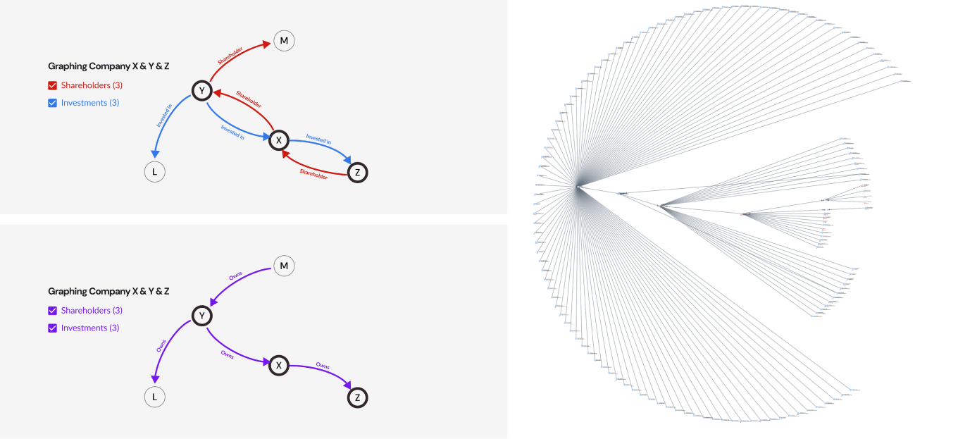
Simplifying how relationships are rendered on the graph helped display complex networks without adding extra noise.
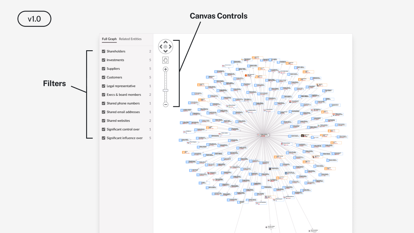
I prioritized what was necessary to ship value. My read was that an unfiltered graph would open to visual noise: hundreds of nodes, no way to orient, no clear entry point. Analysts would open it once, decide it didn’t work, and never come back. A bad first impression on a feature this visible would be harder to recover from than a delayed launch, and a failed Phase 1 meant Pathfinder never gets approved. Filters shipped with v1. The graph was usable on day one.
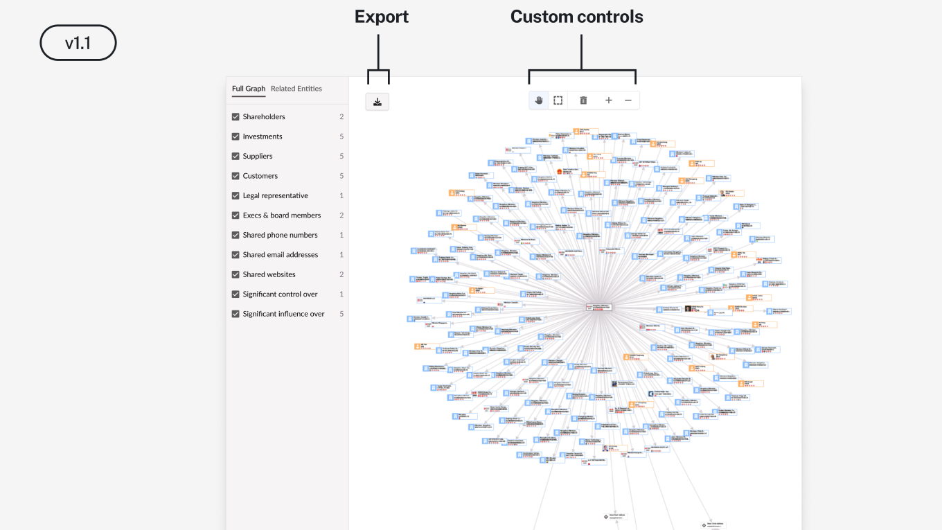
Once analysts were exploring graphs the next problem became obvious. They needed to show the network graphs to someone; their coworkers, a procurement committee, a decision-maker. Export as SVG was the next feature — high resolution, small file size, designed for transport to the boardroom presentation. Download unlocked the external use case.
As analysts began exploring and creating more graphs — filtering, expanding, repositioning company nodes — they were investing real effort. Losing that work on logout wasn’t a minor inconvenience. It was a reason not to use the feature at all. The Save feature came next.
We didn’t just change usage metrics.
We changed sales conversations.
Results.
The feature, Pathfinder, shipped. The answer to “Can I connect Company A to Company B?” became a yes. A research process that previously took days of manual traversal now runs in minutes. Pathfinder became a deal-closer. In a product sold at six to seven figures where every contract requires justifying cost to a check-writer, a feature that answers the question killing demos has a direct line to revenue.
7-figure deal closed
Sales attributed the platform’s new features as being the difference maker in closing the largest deal in company history.
Boardroom ready
High-resolution network exports drop straight into the report, directly impacting decision-making.
Research speed
What took days of manual traversal and research effort now runs in minutes.
User feedback directly validated the work.